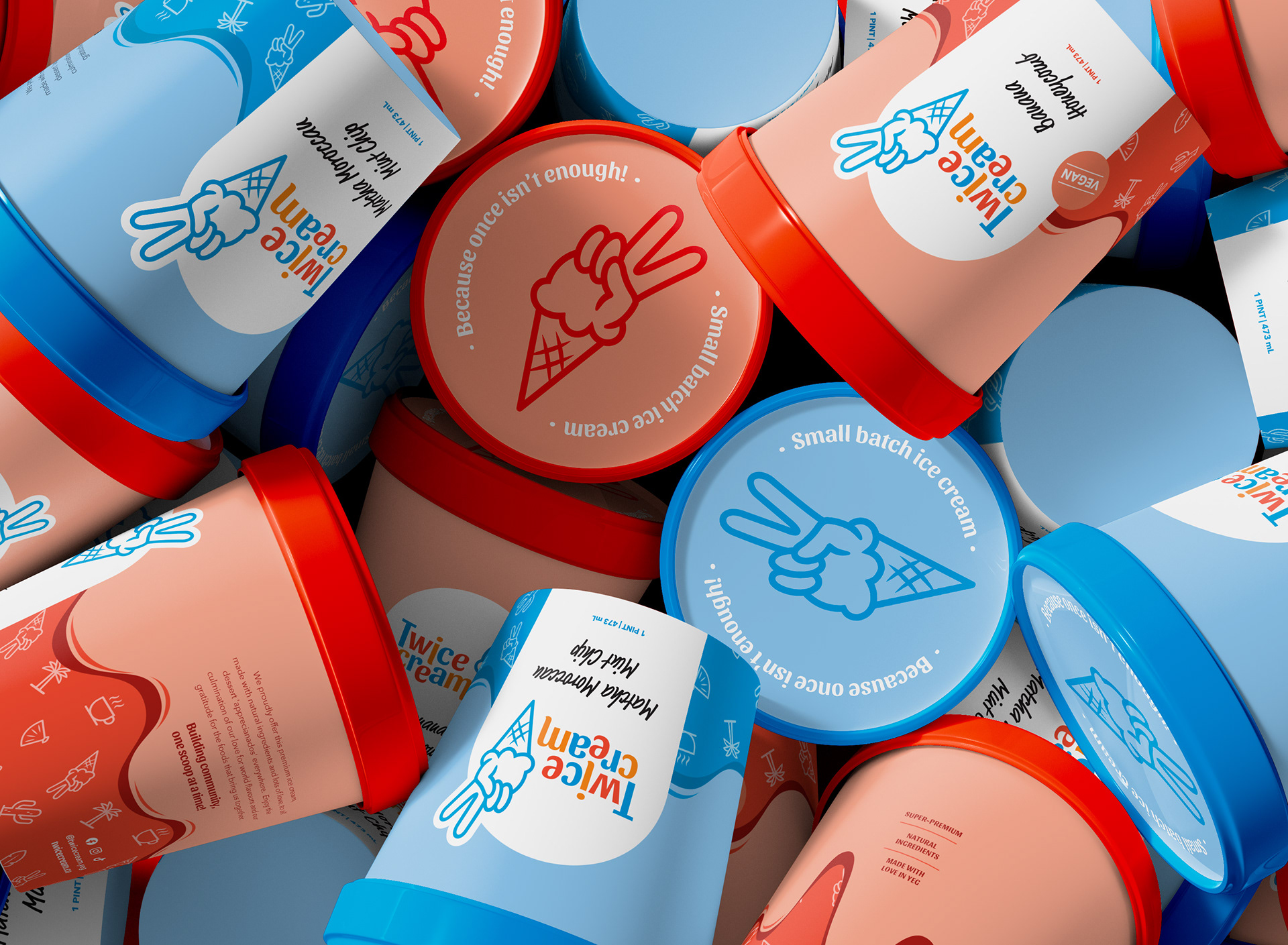
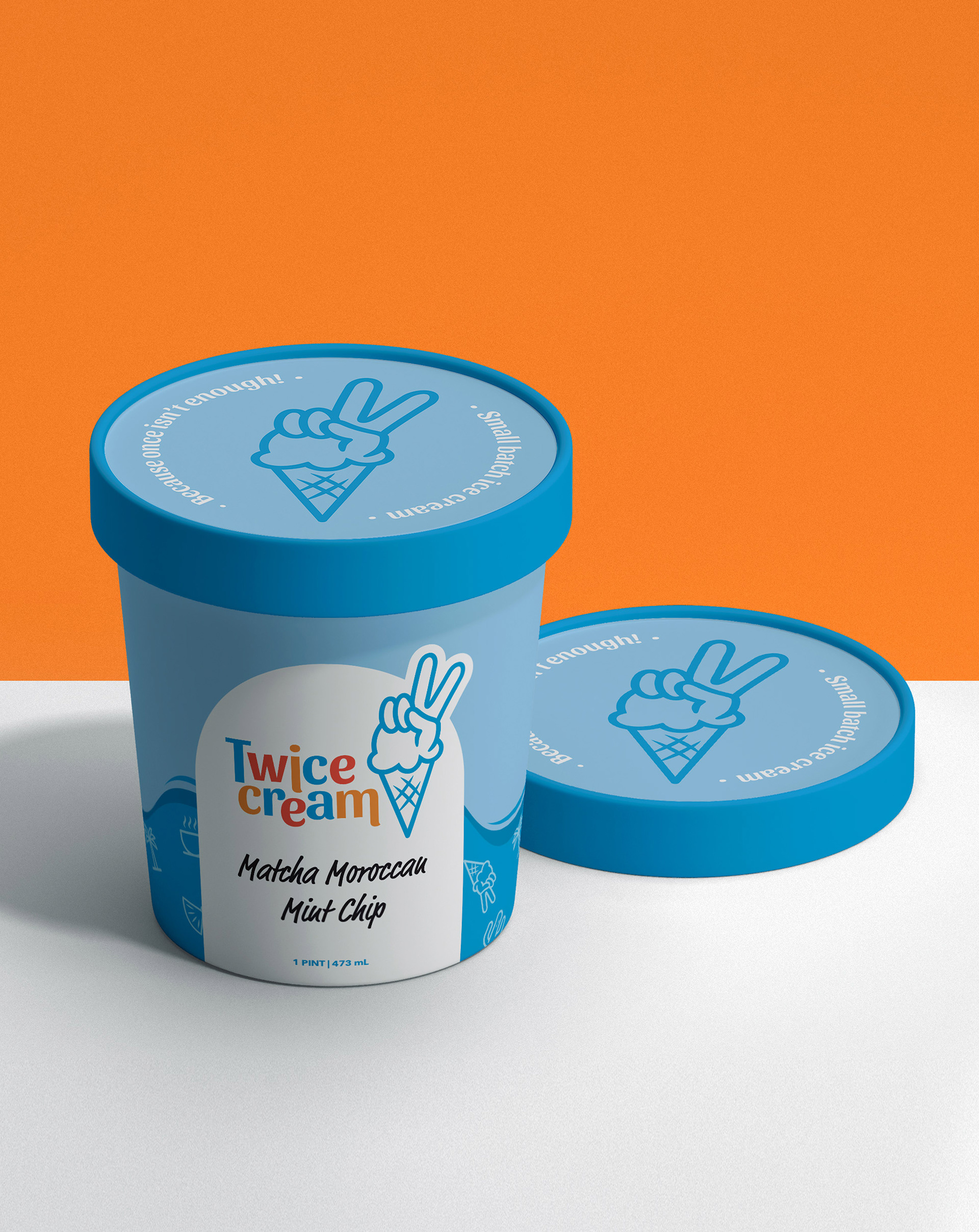
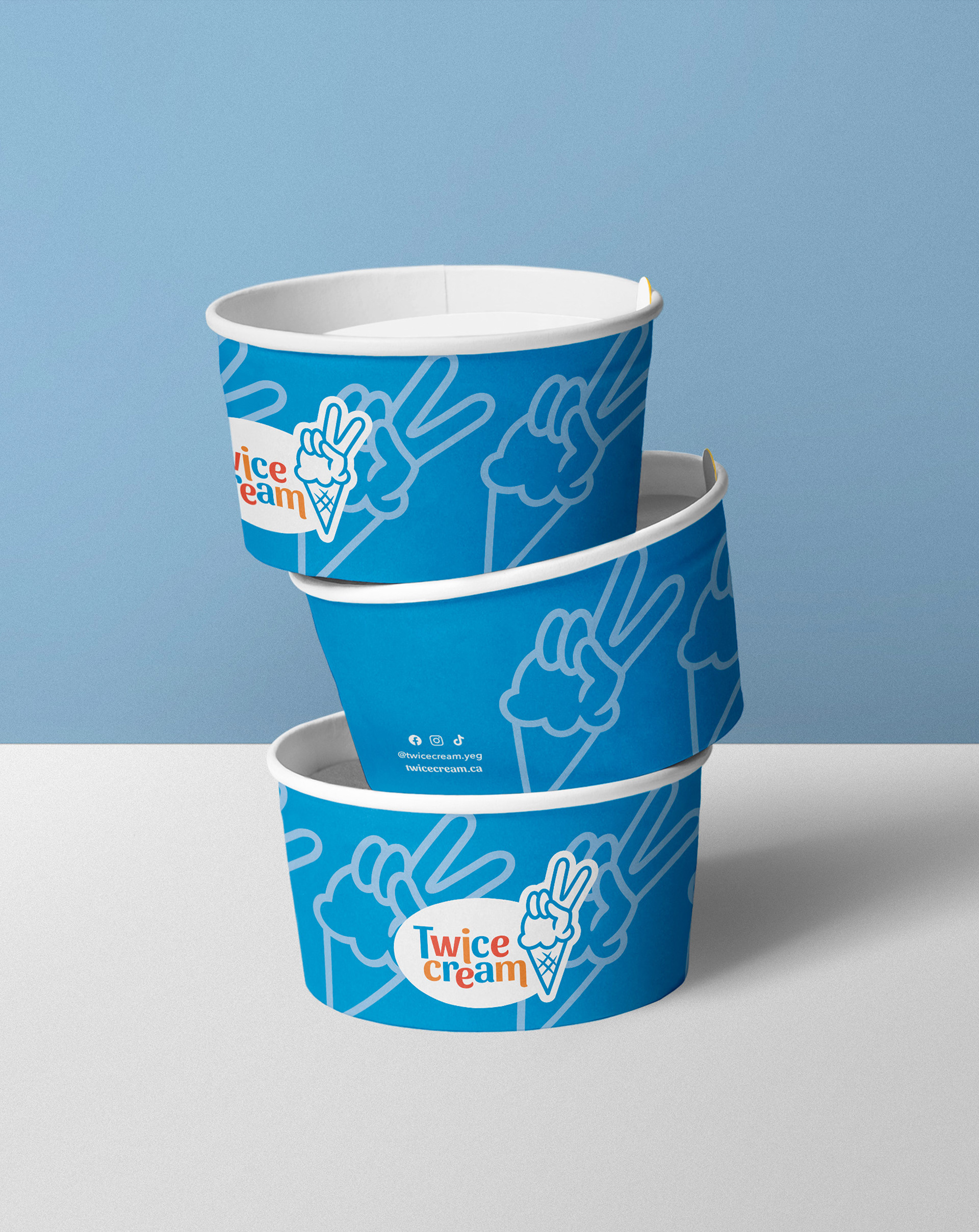
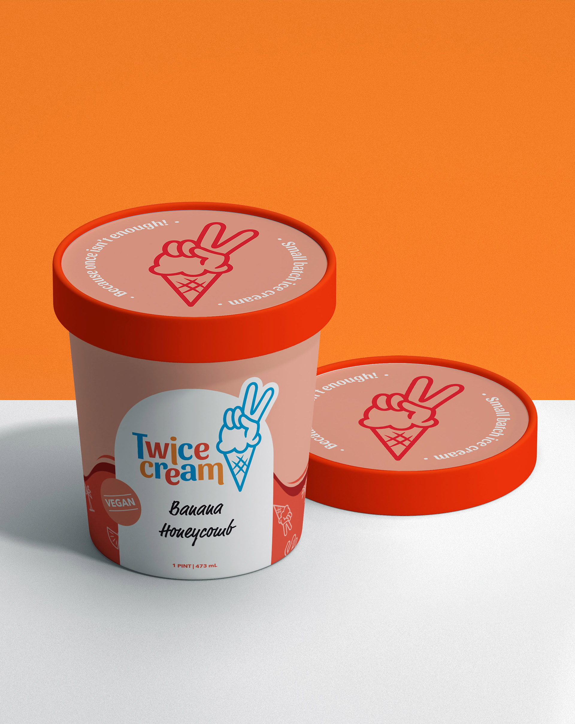
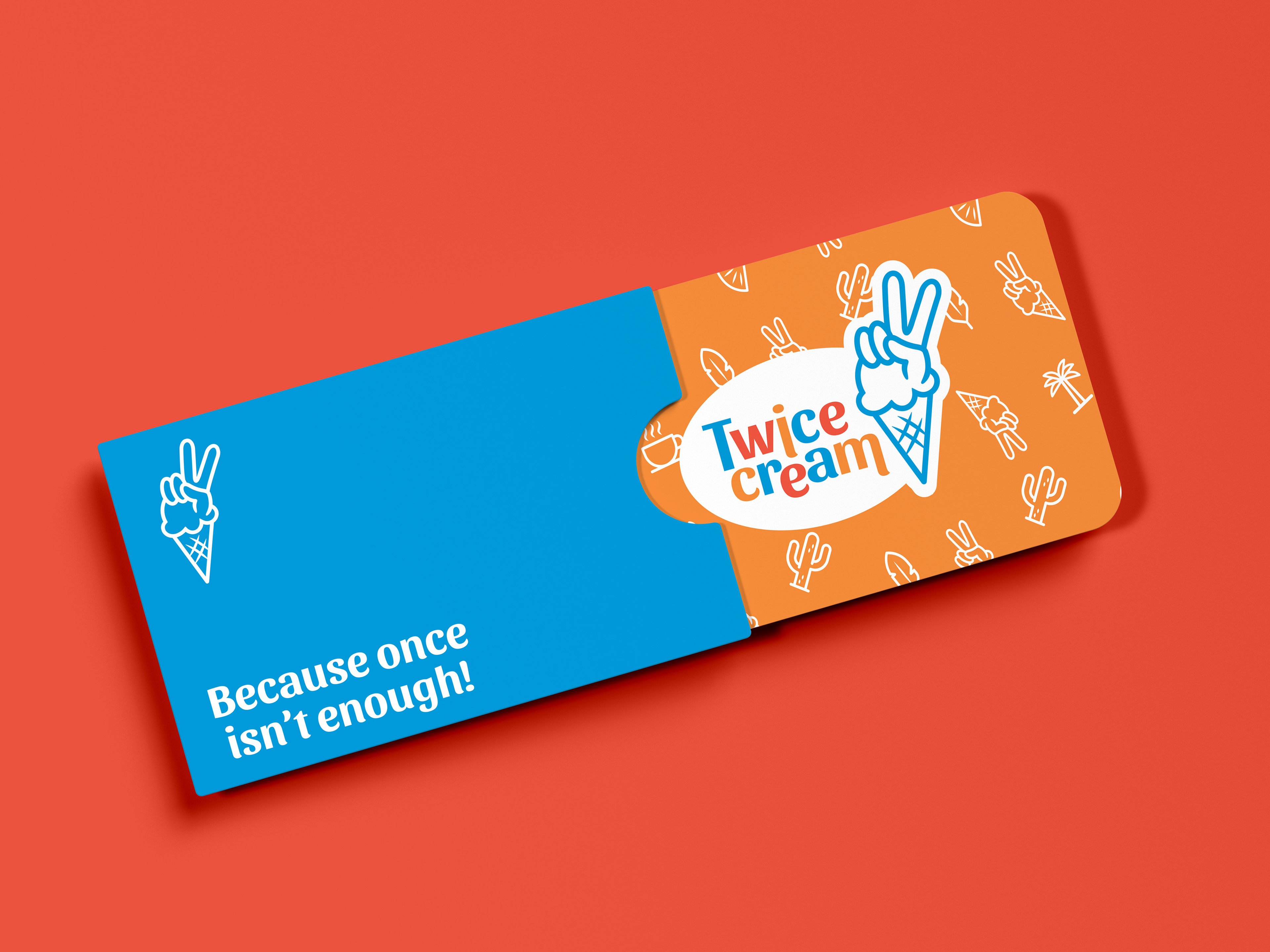
Branding and various collateral for a new ice cream shop. Twice Cream is based on the philosophy of bringing in unique flavour profiles learned from the owner's travels around the world. It was imperative to the client that a peace sign was included in the logo to represent the idea that once is never enough for ice cream. The brand is fun and eye-catching, the icons represent the cultures that inspire their unique flavours.
Type of Work:
Branding, Packaging, & Website Design
Branding, Packaging, & Website Design
Client: Twice Cream
Role: Lead Designer
Created at: Destroythebox Creative